What Are Colour Trend Forecasts and How Do I Use Them?
At the turn of each new year you will hear all about the colour or colour palette of the year. What can be confusing is that these trends/predictions/forecasts are all different depending on who you ask. Look through some of the leading paint brands selections for the expected trends of 2022 and see for yourself:
These companies create these collections by reviewing the current fashion, design, and cultural influences from around the globe, looking for inspiration and patterns to complete a palette of colours that they believe will speak to the upcoming year’s greater purpose and their consumers’ common goals. Below is a collection of the Benjamin Moore Colour Trends for 2022.
A frequent question is “how do you use these forecasted trends and curated palettes?”. The answer is in the title of these collections- these are trends. Trends can be fleeting and they can be contextual. These forecasts come out each year and unless you want to repaint your entire house to keep up with this annual practice you should not take this as a personal colour consultation for your upcoming design project. Instead consider it inspiration to consider new colours, combinations and how they make you feel. If something speaks to you, see how you may work it into your decor through art, accessories and even your wardrobe. Just be prepared to find new inspiration next year, and the year after that, and the year after that…
Often you will see similarities between the different companies’ forecasted palettes, that may range from a handful of colours to 40 or more different hues. These similarities aren’t a coincidence; it is because they all are looking at the same influences e.g. fashion trends. The differences come from the interpretation of what they see as that coming year’s objective or a deeper meaning and how that can be expressed through colour. This interpretation of the trends is what I find so interesting about this tradition - what colours are selected, how they compare across the companies and why certain palettes are chosen - meaning what do they represent to the individuals who selected them and what does that say about our current cultural climate. Similarities that I’ve noticed across the board is primary hues, lots of green tones and a small hint of two colours that I think we will start seeing more of (yellow and purple).
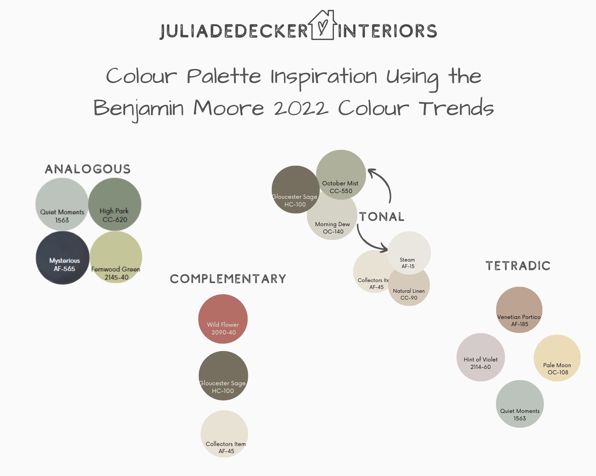
Recently I attended a webinar that was put on by the Decorators and Designers Association of Canada, provided for their accredited members. It was a speaker from Benjamin Moore who talked about their product line and also introduced the Benjamin Moore Colour Trends for 2022. I was interested to hear her take on their 2022 palette. She explained to the group that the 2022 inspiration behind the Benjamin Moore palette was meant to be a back to basics, focus on self-care and a need for escape and levity. This hit home to me as I would say that is exactly what I hope to see for myself this year. The slogan for the Benjamin Moore 2022 Colour Trends was explained as “make room for colour and celebrate individuality”. Below is a collection of colour palettes I pulled using the Benjamin Moore 2022 Colour Trend colours for inspirational purposes. Which is your favourite?
Take a look at the above palettes and consider how they make you feel. Maybe you didn’t think you would want to pair purple and red-orange in your house but the above tetradic scheme is making you reconsider. It is good to open yourself up to new things and consider what habits we have gotten ourselves into and maybe choose our own personal colour scheme and accompanying mantra for the new year. Yes, I realize it’s February… but it’s never too late!


